Midtwon Athletic Club Candidate Experience Audit | Wireframing & UX
Audit conducted on Jan 27, 2025
Wireframing & UX Audit
Audit

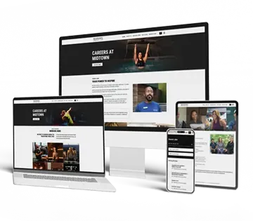
Midtown Athletic Club’s career site demonstrates a strong commitment to wireframing and UX principles, offering a structured and visually intuitive experience for job seekers. The site effectively implements a clear visual hierarchy, ensuring that content is easily scannable and digestible. Navigation elements are consistent across devices, with a sticky header that enhances usability by keeping key actions accessible at all times. The layout follows a well-structured grid system, allowing seamless scaling across desktop, tablet, and mobile, ensuring a smooth experience regardless of screen size.
Interactive elements are thoughtfully designed, with buttons and links providing clear visual feedback through hover effects, color changes, and animations. This responsiveness extends to mobile, where interactive elements react visibly to taps, reinforcing usability and guiding users intuitively through the site. Proper spacing between text, buttons, and sections further improves readability, reducing cognitive load and making the experience feel polished and professional. Headings, subheadings, and body text follow a logical order with strong contrast, enhancing content accessibility and scanability.
Form usability is another highlight, with inline validation and error messaging helping candidates correct mistakes in real time, reducing frustration during the application process. Call-to-action buttons are consistently placed and use a cohesive color scheme, making them easy to locate and interact with. The only notable gap in the UX is the absence of breadcrumb navigation, which could provide additional clarity for job seekers navigating between different sections of the site.
Overall, the career site successfully balances aesthetics, functionality, and user-centric design, making it an effective platform for engaging job seekers. The Very Satisfactory rating reflects a well-executed UX strategy that prioritizes clarity, ease of use, and responsiveness, resulting in a seamless and professional candidate experience. Minor enhancements, such as the addition of breadcrumbs, could further refine navigation, but the core structure is already highly effective.
Best Practices
A well-structured wireframe lays the foundation for an intuitive and engaging candidate experience. Clear visual hierarchy ensures job seekers can easily scan and navigate content, while consistent navigation elements (such as a fixed header) improve usability across devices. Whitespace and readability optimization make career content more digestible, reducing cognitive load.
Buttons and interactive elements should be clearly distinguishable with hover and press effects, ensuring seamless interactions on both desktop and mobile. Grid-based layouts and responsive scaling guarantee an adaptable experience across screen sizes.
Strong form usability is critical—interactive fields, inline validation, and clear error messaging help guide applicants through the process without frustration. Additionally, breadcrumb navigation supports easy wayfinding, reducing drop-off rates.
By implementing these usability principles, career sites create a seamless, distraction-free, and conversion-driven experience for job seekers, leading to higher engagement and more completed applications.
